Last Updated on 3 years ago by soonxindisplay
Signs are among the first things customers notice and should make a good impression. There is much more to designing indoor and outdoor signage than sometimes meets the eye. How to make signage stand out? Just as the first impression of a person we meet may well stick with us for a while regardless of subsequent appearances prove the original one wrong, so too with your signs’ first impression on your customers.
A graphic designer can translate a great design across many communications channels, from vehicles and signage to printed media and the web. Each one of these communication mediums has slightly different viewing capabilities, audiences, and design requirements.
Eye-catching signs with bright colors, vivid graphics, and a simple design and message will surely get great results. We consider many questions and factors before and during the design process; these eight essential tips will make signage stand out among the crowd.

CONTENTS
Environment
People must make immediate – and unfamiliar – decisions whenever they enter an environment. So visual cues, such as maps, directions, and symbols, help guide people safely and securely.
How to make signage acclimatization. The environment will help us utilize better-contrasting colors. Where is the sign going? Will the character go on the grass near a sidewalk and busy traffic? How close will viewers of your design /message be? Will this sign be going across all types of different environments? These are just some of the questions we may ask you to help get the maximum impact on how to make signage stand out.


Content
Function and content are design work necessary when you ask how to make signage well. As a sign product has value and an excellent shape, we have to know where to use it and its function; we often say, “good designers think from the content first.”
First, pay attention to the careful use of popular elements (to avoid losing features in the short term), – how to make signage more attractive.
Many designers use too many popular elements in the design of acrylic signs. Still, the notable features sink too fast and will disappear in the eyes of the public over time, so their visual effect is also poor. Designers should be careful to use popular elements in signage design. Unique signage design should be popular and avoid risks at the same time.
Second, pay attention to the recognition of signs (increase memory elements)
Like acrylic signage design, it is material mainly using high-catching; this kind of design is worthy of consideration, especially paying attention to the identification of the signage; the surface is not easy to be too complex and needs to be concise.
Third, Pay attention to the matching of fonts (cater to the design theme)
Because acrylic signage has a wide range of applications, and its style can be changed at will with the design route, which is also one of the essential reasons why it is widely used, so in professional signage design, special attention should be paid to the matching of fonts and the style attributes of patterns, such as euphemistic style, warm style, and entertainment style.
Proportion
How to make signage in suitable proportion. When creating and determining the size and balance, we must use “ergonomics” to think about the design, such as corner tilt angle, font size, and visual distance; every detail should be carefully considered for the customer, over and over again, this kind of product design can be called “people-oriented.” Understand the size of various materials; material size is one of the design standards; the plan should consider whether the designed material has such a size, not too large or too small, as it may cause waste and unnecessary losses to the company and customers.
Manner
How to make signage manner? Style is the character of a system. A set of designs that integrates the logo and orientation of the building must be based on the style of architecture and decoration. In addition to the differences in style, the architecture of different periods is also reflected in the details, such as the symbols of elements, the overall architectural style, and details of a project, which are dominated by its cultural background. Understand the style and aspects of the project so that you can make what the customer wants. To achieve the logo into the building, as from the growth of the highest state.
Color
Follow the application part of the VI logo of the customer enterprise, follow the inclusiveness of tone and architecture, and be clear at a glance at a critical moment; there must be a deep and light contrast in color, a difference between bright and matte, and a comparison between logo and background color.
Attention to not too many colors (to prevent confusion)
In signage design, one of the essential principles is that lack than to abuse, to clip the indispensable elements among them, to remove the unimportant content from the design scope, and to make reasonable use of color. Generally speaking, the color of the acrylic sign only needs black and white; if there is a particular need, you can add 1 or 2 colors, but pay attention to not too many colors, so visitors have a dazzling feeling.
This ties in with our first tip. What might seem obvious to many goes over others. Use contrasting colors in your designs to accentuate parts of the message that may have more importance. Continuing from our first point, we often try to contrast the colors of your design with those found in the environment your sign will be located. If your character is moved across various settings, we will choose safe, friendly colors that blend with all backgrounds.
How To Make Signage From Detail
Good products, architecture, decoration design, and their appearance is unassailable. Therefore, in the design process, we try not to appear screws in the formation; the gap between the plate and the board, and the interface, should consider the problem of edge closing and closing. A lousy edge may hurt people’s skin, which should be considered in the design process. Avoid production only to find that does not let cracks or defects affect the quality of our products.
Keep it simple
Another simple trick to ensure your design gets seen is to keep the message simple. On most signage, you don’t have the same luxury as a magazine or website, where your viewers are looking at your design 1ft away from their screen. Keeping the sign “simple” by listing critical services (rather than EVERY service you offer) helps eliminate clutter. This lets you quickly catch passing individuals’ eyes and better deliver your advertisement.
Material
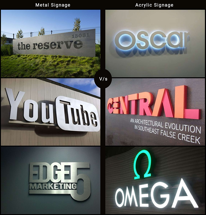
How to make signage using suitable Material. In the process of the use of Material materials, we should give full play to the material’s texture, understand each material’s different characteristics, and find its unique surface the Material. Expensive design, its materials are not necessarily the most costly, the most costly materials; if the plan is not good, it is easy to become vulgar. The two most commonly used materials are metal and acrylic.
Metal signage isis available in multiple finishes like Brass, Copper, Bronze, Stainless steel & Aluminum. They are comparatively heavy and expensive but a commanding option. It is an ideal option for brands that want to be perceived as experienced and trusted.
Acrylic signage is available in many color options, very flexible hence the scope of creativity. They provide a fresh, new-age look to a business outlet. This is ideal for brands that want to be perceived as new, new-age, and offering something innovative.

Installation
If you are a worker, know how to install and how to assemble, can read the drawings, and understand the process sequence; if not, you must think in place and pay attention to its logic and feasibility. Because this is the designer’s work, do not let the workers design and think about the defective parts for you. Never blame the workers for the construction not being in place; only the design is unreasonable and Ill-conceived.
Maintenance
Maintenance customers who buy our products do not want it to be one time but want to use it repeatedly, so the design process must consider whether the content can be replaced and whether it is convenient for future maintenance and update.


