
 EN
EN ES
ES FR
FR DE
DE IT
IT PT
PT AR
AR JA
JA4 Store Display Tips to Improve Your Sales
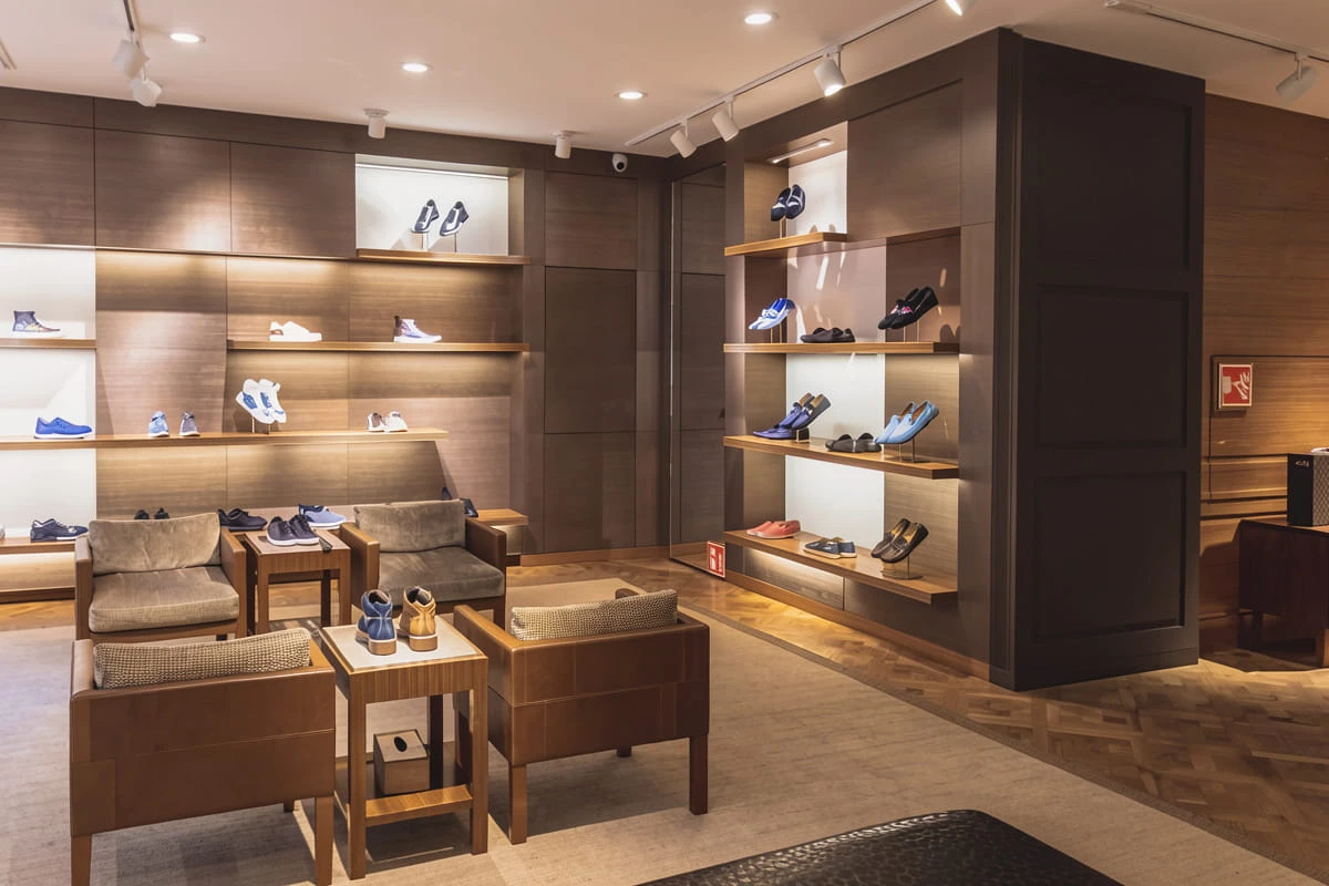
Retail display repeats one rule more than any other: eye level is buy level. Put the product at eye height and people will see it.
The measurements say otherwise. Below are four things worth knowing about where attention goes, which direction shoppers bias toward, how the three standard layouts differ, and why the height of a shelf changes what a customer decides to buy.
1. The Eye-level Rule Is Wrong
The logic behind the rule is clean. Retail research does associate eye-level and higher shelves with higher sales, and planogram agreements between manufacturers and retailers rest on the premise that moving a product to eye level reliably lifts sales.
That premise does not hold.
Chen et al. ran in-store ambulatory eye-tracking and measured where shoppers actually fixated. The height with the greatest propensity to attract attention sits about 14.7 inches below a shopper’s eye level, not at it. With an average eye level of roughly 62 inches in their sample, the optimal product height came out at about 47 inches off the ground, close to four feet. A POPAI mass merchant study from the same period landed in the same place.
The distribution agrees. Median height of the products shoppers attended was about 43 inches, with a peak between 30 and 52. Median vertical distance below eye level was 19 inches.
Take a standard five-level gondola with shelves at 24, 36, 48, 60, and 72 inches. The 48-inch shelf draws about 16% more attention than the top or bottom shelf. On a shop floor that shelf is the eye-level shelf by convention, two tiers below where the rule would have put it.
The trouble is that nobody agrees on a number. Published recommendations for the optimal display height run from about 36 inches to about 67 inches, and they do not converge inside that range. Herb Sorensen, in Inside the Mind of the Shopper, calls the old rule “quite simply untrue” and puts the sweet spot between the waist and the shoulder. Other practitioners land on shoulder level, or between the waist and the chest. Dreze, Hoch, and Purk found the optimum 6 to 8 inches below eye level, and POPAI’s pilot measured shoppers looking down about 25 degrees from eye level as a matter of habit.
For a display manufacturer this reads as a design constraint rather than a slogan. A shoe display rack with tier spacing built around the 48-inch band does something a unit built around 60 inches does not. Tier spacing is a merchandising decision, and it gets specified like one.
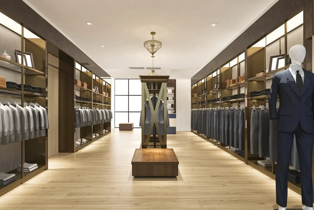
2. Left, Right, and Which Way the Aisle Runs
Height gets all the attention. Horizontal position has findings that are just as actionable.
While traversing an aisle, shoppers showed a 21% greater propensity to attend product categories on their right (Chen et al.). The bias held for left-handed shoppers too, so it is not a handedness effect.
Facing a shelf straight on, the advantage reverses. Left position beats centre, which reads as shoppers doing with a shelf what they do with any row of text and working across it from the left.
Kastner-Jamsawang and Wagner added a third variable, which way the shopper was walking. In two discount grocery stores carrying identical assortments at identical prices, one guiding customers clockwise and one counter-clockwise, walking direction significantly changed how accurately shoppers formed mental maps.
Read together, these describe an aisle nobody experiences symmetrically. The run a shopper passes on their right while walking in gets more attention than the mirror run on their left. Stand facing that same aisle and the left-hand run gains the advantage. Flip the customer’s direction of travel and both relationships swap.
The vertical zones from Dreze et al. remain a workable frame: top or stretch level above about 6 feet, the least valuable and often omitted in spacious stores; eye level at 4 to 5 feet; touch level at 3 to 4 feet, roughly chest to waist; bottom level below 3 feet, which means bending for the customer. Across laboratory and in-store field studies alike, eye and touch level beat top and bottom.
For fixture design this lands as orientation, which a floor plan can hide. Which side of an aisle a unit faces, and which direction it sends the customer, changes what gets seen without moving a single product.
3. Grid, Freeform, Racetrack
Layout research sorts store plans into three conventional types: freeform, grid, and racetrack. Racetrack is often called a loop or main-aisle layout. Some taxonomies add a fourth, the circulation spine, which puts a traffic loop around the perimeter with a customer path cutting through the middle.
| Grid | Freeform | Racetrack | |
|---|---|---|---|
| Shelf arrangement | Structured, rectangular | Unstructured, random | Organised by product themes |
| Shelf height | Mostly high | Mostly low | Varying |
| Pathways | Long, clear rectangular pattern | No distinctive pattern | One main pathway through the store |
| Typical store | Supermarkets | Clothing stores | Large department stores |
Grid uses long parallel pathways. The rectangular shelf arrangement fits how consumers shop and supports fast, efficient trips, which is why it is the most preferred layout among supermarket retailers.
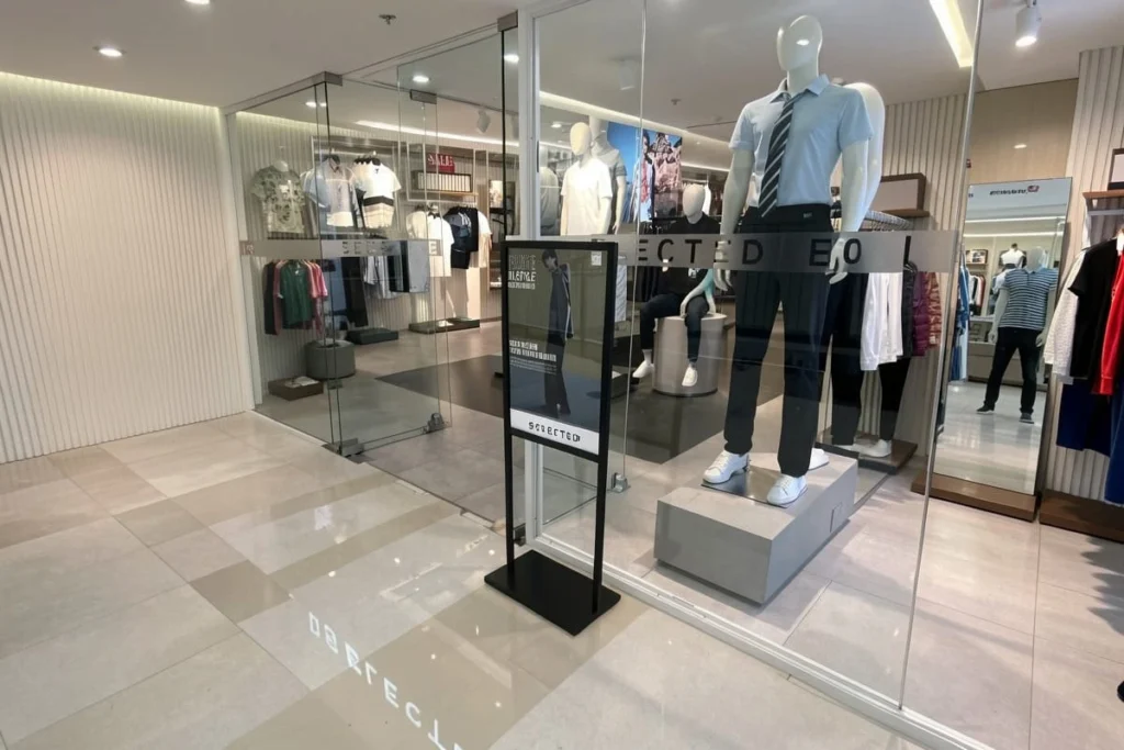
Freeform is an unstructured arrangement of aisles, shelves, and displays, used mostly by clothing stores. The emphasis is on ease of finding products, which is part of why most freeform stores run low shelves. Shoppers spend more time in these stores, and extended shopping time matters for how much they spend.
That effort cuts both ways. A navigational challenge can be enjoyable, while frustration at not finding a product causes shoppers to give up on their search. Freeform earns its reputation as the most entertaining layout precisely because of that effort.
Racetrack runs one central main aisle along the full length of the store, dividing the floor into departments that each carry their own category. Its job is to lead the shopper through as much of the store as possible, and the result is an unusual kind of shopping trip.
These three are also the reason fixture families split the way they do. Low shelving suits freeform, high shelving suits grid, and racetrack needs fixtures that work at several heights along a path rather than facing a queue.
Worth knowing before you trust the typology too much: a Wageningen PhD using virtual stores found that shoppers respond to perceived orderliness more than to the grid-versus-freeform label itself, and that parallel, aligned shelving registers as orderly while random angles do not (Ploydanai, 2019). Order of the shelves, not the name of the layout, is doing most of the work.
4. Why Height Changes What People Want to Buy
Height affects how much attention a shelf gets. It also affects what the shopper decides once they start looking.
Van Kerckhove, Geuens, and Vermeir published “Floor Is Nearer than the Sky” in the Journal of Consumer Research in 2014, working through a series of experiments on where people point their eyes. The logic runs from perception to decision. People look down to process what is near and look up to process what is far. Those habits have generalised: downward eye and head movement now acts as a proximity cue and triggers concrete processing, while upward movement triggers abstract processing.
The downstream behaviour is the part worth having. Consumers chose more feasible products when looking down and more desirable products when looking up. They were also more consistent with their own stated preferences while looking down.
So a shelf above eye level does not only sit quieter. It changes the kind of thinking the product gets. Matching height to what you are selling matters more than matching it to what looks balanced on the fixture. Feasibility sells lower, where detail and comparison carry the argument. Desire sells higher, where the shopper is already in the mood to want something.
SOONXIN builds acrylic and metal display fixtures for retail brands, chain stores, and distributors, from logo blocks and sign holders through poster stands, shoes, jewelry, cosmetics, clothing, bags, and organizers. Most of the decisions above happen long before anyone picks a finish, and they are worth getting right first.
References
Chen, M., Burke, R. R., Hui, S. K., & Leykin, A. (2021). Understanding lateral and vertical biases in consumer attention: An in-store ambulatory eye-tracking study. Journal of Marketing Research, 58(6), 1120 to 1141.
Kastner-Jamsawang, J., & Wagner, U. (2021). Using mobile and stationary eye tracking to better understand consumer shelf perception. Multidisciplinary Business Review, 14(1), 41 to 60.
Van Kerckhove, A., Geuens, M., & Vermeir, I. (2014). Floor is nearer than the sky: How looking up or down affects construal level. Journal of Consumer Research, 41(6), 1358 to 1369.
Dreze, X., Hoch, S. J., & Purk, M. E. (1994). Shelf space and display competition: The determinants of a retailer’s decision to allocate space. Journal of Retailing, 70(2), 203 to 218.
Sorensen, H. (2009). Inside the mind of the shopper: The science of retailing. Wharton School Publishing.
POPAI (2014). 2014 mass merchant shopper engagement study. Point of Purchase Advertising International.
Ploydanai, K. (2019). Designing attractive stores: How the spatial layout of physical stores affects consumers’ responses. PhD thesis, Wageningen University & Research.